Every year the website design trends follow a particular theme.
This year the set theme is that of minimalism—back to basics.
New technologies like Augmented Reality are striving to become a part of the web world, while a few forgotten techs, or rather fonts, have made a comeback.
So, without further ado, let’s dive into the web world and explore these individual web design trends!
1. Parallax Effects
Parallax scrolling effects continue their reign as a popular web design element even in the year 2021.
It is a special effect in which the background and the foreground of a website are designed to move at a different rate to create a sense of depth and three-dimensionality.
In the pre-parallax scrolling era, designers had to cram a large amount of information above the fold—the initial part of the website that can be viewed without scrolling. And the scanning pattern of the majority of website users justified the trend.
With the arrival of parallax scrolling, however, designers are no longer confined to present everything in a single corner of a web page.
By remodeling the passive scrolling into an active, engaging task, parallax effects work to glue the users to your website.
This gluing effect is known as the dwell time—the amount of time a user spends on a website. And the data analysis has shown that dwell time, indirectly, is great for SEO.
2. 3D Animations
Animations are one of the most popular web design trends. They even make it in the list of top mobile design trends.
The reason behind their popularity is that they provide a creative solution to boost the appeal and user-friendliness of a website.
3D web animations can be used for scrolling effects, loading screens, welcoming messages, or even storytelling. The possibilities are just endless.
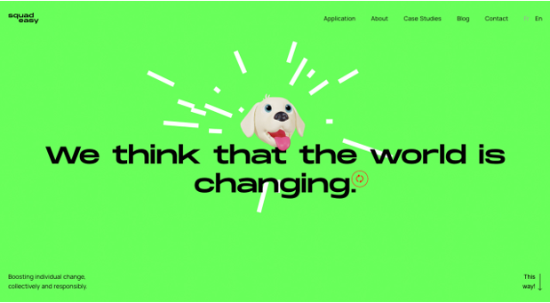
Take Squadeasy as an example; their overall web design is quite simple. But an overlaid 3D animated dog has made all the difference. The dog tracks the user’s movements, which makes scrolling a much more fun and engaging task.
3. Augmented Reality
AR is a bridge between virtual reality and the physical world. And this bridge is bridging the gap between a user and a product.
Look at Gucci, for example. Gucci, in an effort to employ AR to generate sales, partnered with Snapchat and launched a virtual shoe try-on. The technology is the first of its kind, and it lets people try a vast collection of shoes without even visiting the store at all.
This bridging effect is what makes it one of the most popular web design trends, particularly in the e-commerce sector.
Moreover, the AR offers a 360° experience. The addition of the Z-axis makes it possible for the designers to add more bits of information on a single page.
4. Vintage Fonts
Fonts speak for the character or the persona of your website.
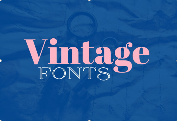
Vintage or retro fonts, as the name suggests, are a thing of the past. But 2021 has been the year of their resurgence, and they’ve come to reclaim their past glory.
Vintage fonts are back in the game because they are attractive, and they grab the user’s attention – not to mention the versatility and easy-going nature with any kind of website layout.
And their uniqueness and defined outline scream the message that makes them an ideal choice for call-to-action buttons.
Just make sure that the font is easily readable across all the devices and doesn’t violate the mobile design trends.
5. Story Element
Who doesn’t like a story or two? In fact, the effectiveness of the stories as an engaging method has been proven time and again.
How to properly utilize one of the most powerful website design trends?
- Wrap your story in a series of images and create a visual story.
- Turn the complex ideas into a series of simple illustrations. For example, Shopify employs precise illustrations to give merchants insights into the working of the platform.
- Utilize the power of words. Words can deliver a powerful message and prompt people to act.
Stories can tell more about your business than any sort of advertisement ever could.
Think about the story you want to tell the world because a good story can turn a random visitor into a regular customer.
6. Dark Mode
The dark mode is a design element that just came out of nowhere but has now taken the design world by storm.
Before we get too ahead of ourselves, let’s clear one thing.
The dark mode isn’t suitable for every kind of website. It must be used cautiously.
For example, dark colors are often associated with negative connotations like evil or death. But there’s also an enigma to dark colors, a hint of mystery or elegance.
So, don’t use it for the sake of keeping up with the trend. Think about the image you want to portray and approach the dark mode accordingly.
7. Minimalistic Colors
Web design trends have gone minimalistic in 2021.
The trending minimalism can be found in everything from the layout to the color scheme of a website.
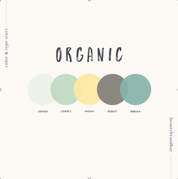
Instead of opting for a fancy combination of colors, web designers are playing with comfortable colors.
Between the two extremes of dark and light, they’ve found a middle ground in soft colors that are easier on the eyes.
Also, the current world scenario justifies this trend shift.
Since people are spending more time on-screen, designers are experimenting with hues of pink, warm brown, and light shades of green that are known to reduce eyestrain.
Take Away
As long as the competition exists, there will always be a race to stand out from the crowd. Businesses will keep outdoing each other by integrating various individual trends mentioned in the article.
But what’s trending today might not be significant tomorrow. That’s because web design never ceases to evolve. And every evolution has a special theme attached to it.
