|
Getting your Trinity Audio player ready...
|
Your pricing page is more than just a menu of services and costs. It’s arguably the most critical sales page on your entire website. It’s the digital equivalent of sitting down at the negotiation table. This is the moment a curious prospect decides whether to become a paying client or to click away, lost forever in the vast expanse of the internet. For service businesses and agencies, where value can feel intangible and trust is paramount, a poorly executed pricing page can be a silent business killer.
Many businesses treat their pricing page as an afterthought—a simple grid with numbers and a “Buy Now” button. This approach is a monumental mistake. It ignores the complex psychology of purchasing decisions, the need for clarity, and the power of strategic persuasion. A high-converting pricing page is a masterclass in conversion copy, user experience, and strategic pricing page design. It doesn’t just present prices; it frames value, builds confidence, and guides the user to the best possible decision for their needs.
If your pricing page isn’t performing, the problem likely falls into one of three areas: its structure is confusing (Layout), its prices feel arbitrary or expensive (Anchoring), or it fails to make the customer feel safe in their decision (Risk-Reduction).
In this comprehensive guide, we will deconstruct the anatomy of a pricing page that converts. We’ll explore battle-tested layouts that provide clarity, delve into the powerful psychological tactic of price anchoring to frame your value correctly, and outline the essential risk-reducers that eliminate doubt and build the unshakable trust needed to win over your next best client.
Part 1: The Foundation – Strategic Pricing Page Layouts
Before a potential client ever considers your price, they absorb the design and structure of the page. A confusing, cluttered, or overwhelming layout creates friction and uncertainty. The goal of your layout is to make the decision-making process as simple and intuitive as possible. The user should instantly understand their options and be able to easily compare them to find the right fit.
While there are endless ways to design a page, most successful pricing pages for agencies and service businesses fall into one of these proven formats.
The Classic Tiered Column Layout
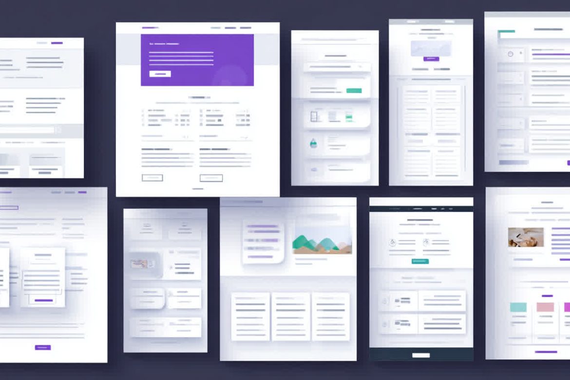
This is the most recognizable pricing page layout for a reason: it works. Typically featuring three or four distinct packages side-by-side in columns, this layout excels at making comparisons easy. It naturally guides the user’s eye across the options, allowing them to quickly assess the differences in features and price.
Best for: Businesses with a clear progression of service levels, such as a marketing agency offering “Basic,” “Growth,” and “Scale” packages, or a consultancy with “Starter,” “Professional,” and “Enterprise” tiers.
How to Optimize It:
- Limit to 3-4 Options: More than four choices can lead to “analysis paralysis,” where the user is so overwhelmed they choose nothing. Three is often the sweet spot.
- Highlight the “Most Popular” Plan: This is a crucial element of effective pricing page design. By visually emphasizing one option (using a different background color, a subtle border, or a “Most Popular” banner), you accomplish two things. First, you leverage social proof—the implication that most people choose this option makes it feel like the safest, most logical choice. Second, you simplify the decision for the user, gently guiding them toward the plan that likely offers the best value and serves the needs of the majority of your target audience.
- Clear, Benefit-Oriented Names: Don’t just call them “Package 1, 2, and 3.” Give them names that reflect the outcome or the target user, such as “Solo Entrepreneur,” “Growing Team,” or “Corporate Division.”
The Feature Comparison Grid
When your services are complex and feature-rich, a simple column layout might not provide enough detail. This is where the feature comparison grid shines. In this format, the packages are still listed as columns, but a comprehensive list of features is itemized down the left-hand side in rows, with checkmarks, values, or short descriptions filling the grid.
Best for: SaaS companies, technical agencies, or any business where the specific deliverables and features are a major selling point.
How to Optimize It:
- Group Features Logically: An endless list of checkmarks is just as overwhelming as too many packages. Group your features into collapsible categories like “Core Services,” “Reporting & Analytics,” “Dedicated Support,” and “Add-Ons.” This makes the information digestible.
- Use Tooltips for Detail: Instead of cluttering the grid with long explanations, use icons or tooltips that reveal more information on hover. This keeps the design clean while still providing the necessary depth for discerning buyers.
- Visualize Value: Don’t just use a checkmark. If a feature has a quantifiable limit, state it clearly (e.g., “10 Social Media Posts,” “500 Email Subscribers,” “Bi-Weekly Strategy Calls”). This makes the value difference between tiers concrete.

The “Build Your Own” / Interactive Calculator
For some services, a one-size-fits-all package doesn’t make sense. If your pricing is based on specific variables—like the number of employees, website traffic, project scope, or ad spend—an interactive calculator is the perfect solution. This layout uses sliders, dropdowns, or input fields to let the user define their needs, and the price adjusts in real-time.
Best for: Agencies with highly customized services, consultants who price per project, or any business where pricing is variable.
How to Optimize It:
- Instant Gratification: The price must update instantly as the user adjusts the inputs. Any delay creates a frustrating user experience.
- Provide a Clear Starting Point: Don’t present a blank slate. Pre-populate the calculator with a common use case or a recommended starting configuration.
- Follow Up with a Clear Call-to-Action (CTA): Once the user has their custom price, what’s next? The CTA should be prominent. It might be “Book a Consultation to Lock In This Price” or “Get Started with Your Custom Plan.”
Regardless of the layout you choose, every pricing page needs a powerful, benefit-driven headline. Instead of a bland title like “Our Prices,” frame it with value: “Simple, Transparent Pricing for Ambitious Brands” or “Find the Plan That Will Scale Your Growth.” This sets the stage for the rest of the page, shifting the focus from cost to investment.
Part 2: The Psychology of Price – Anchoring and Perception
Once you have a clear and logical layout, the next step is to present your prices in a way that makes them feel fair, logical, and valuable. This is less about the numbers themselves and more about the psychology of how we perceive those numbers. The most powerful tool in your arsenal here is price anchoring.
Price anchoring is a cognitive bias where individuals depend too heavily on an initial piece of information (the “anchor”) when making decisions. In the context of pricing, the first price a customer sees will profoundly influence their perception of the value of all other prices.
Imagine walking into a luxury boutique and seeing a handbag for $5,000. Moments later, you see another one for $800. Suddenly, $800 feels like a bargain. The $5,000 bag served as an anchor. You can, and should, use this same principle on your pricing page.
Implementing Price Anchoring on Your Page
- The High Anchor / Decoy Plan: One of the most common ways to use price anchoring is to lead with your highest-priced option. If you have three tiers, list them from most expensive to least expensive. The high price of the first plan establishes a strong anchor, making the other options appear more affordable and reasonable by comparison. You might even include a premium “Enterprise” or “White Glove” plan that you don’t expect many to buy. Its primary job is to make your mid-tier, “most popular” plan look like an incredible deal.
- Strikethrough and “Was/Now” Pricing: Showing a previous, higher price crossed out next to the current price is a classic anchoring technique. For example: “~~$1,500/mo~~ Now $999/mo.” This immediately anchors the value at $1,500, making the $999 price feel like a significant discount. This tactic should be used honestly, such as for a limited-time promotion or for annual plans paid upfront.
- The Power of Annual Billing: Offer a discount for paying annually and display the savings prominently. For instance, “$299/month, or save 20% with our annual plan at $2,870/year.” The anchor is the higher monthly cost, making the annual lump sum feel like a smart, value-driven investment.
Framing Value with Conversion Copy
Anchoring isn’t just about placing numbers strategically; it’s also about the language you use to describe them. Your conversion copy should consistently frame your price as an investment in a desirable outcome, not an expense.
- Focus on ROI, Not Cost: Connect the price to the value it delivers. Instead of just listing features, describe the results those features create.
- Instead of: “SEO Audit Report”
- Try: “Uncover Hidden Revenue Opportunities with a Deep-Dive SEO Audit.”
- Break It Down: Large numbers can be intimidating. If you can break down the price into a smaller time frame, it can seem more manageable. A “$6,000” project fee can be reframed as an “investment of $500/month over the year” or even “less than $17 a day to double your lead flow.” This technique, known as “unit pricing,” minimizes the initial sticker shock.
- Use Words of Investment: Swap out words like “cost” and “price” for “investment,” “plan,” or “tier.” It’s a subtle shift, but it reinforces the idea that the client is purchasing a positive future result, not just spending money.
Part 3: Building Trust – Risk-Reducers That Close the Deal
A customer has navigated your layout, understood your features, and feels the price is fair thanks to your strategic anchoring. They are on the verge of making a decision. But in their mind, a chorus of doubts begins to surface:
- “What if this doesn’t work for my business?”
- “What if I’m making the wrong choice?”
- “Is this company legitimate?”
- “What if I get locked into something I can’t get out of?”
Your final job on the pricing page is to silence these doubts. You do this by proactively addressing their fears with risk-reducers. These are elements that build trust, offer security, and make the decision to buy feel safe and smart.
The Most Effective Risk-Reducers
- Social Proof: Testimonials, Case Studies, and Logos: Nothing builds trust faster than seeing that other people—especially people similar to them—have already had success with your service.
- Testimonials: Don’t use generic quotes like “They did a great job.” Use specific, results-oriented testimonials that include the client’s name, company, and photo. A quote like, “Working with XYZ Agency increased our qualified leads by 75% in the first quarter alone,” is infinitely more powerful. Video testimonials are even better.
- Client Logos: If you’ve worked with recognizable brands, display their logos prominently. This is a visual shortcut to credibility.
- Mini Case Studies: Briefly showcase the problem, your solution, and the quantifiable result for a past client. For example: “We helped a B2B SaaS client reduce their cost-per-acquisition by 40% through a targeted content strategy.”
- A Powerful Guarantee: A guarantee is the ultimate safety net. It tells the customer that you are so confident in the value you provide that you are willing to take on the risk yourself.
- Money-Back Guarantee: The gold standard. A 14-day or 30-day money-back guarantee can dramatically increase conversions by removing all financial risk.
- Satisfaction Guarantee: If a money-back guarantee isn’t feasible, offer a satisfaction guarantee. “If you’re not happy with our initial strategy, we’ll continue to refine it at no extra cost until you are.”
- Performance Guarantee: Tie your service to a specific outcome. For a marketing agency, this could be: “We guarantee a 20% increase in organic traffic within six months, or we’ll work for free until we do.”
- A Proactive FAQ Section: Don’t make users hunt for answers. Address their biggest questions and objections right there on the pricing page. An FAQ section is your opportunity to overcome their final hesitations. Include questions like:
- “Is there a long-term contract?”
- “What does the onboarding process look like?”
- “Can I upgrade or downgrade my plan later?”
- “Who is this service not a good fit for?” (This level of honesty builds immense trust).
- “Are there any hidden fees?”
- Trust Badges and Seals: Add visual symbols of security and authority. These can include secure payment logos (if you take payments on the site), industry awards you’ve won, or “As Seen In” logos from publications that have featured you.
Conclusion: Your Pricing Page is Your Best Salesperson
Your pricing page is not a passive information document; it is an active, strategic sales tool. By shifting your mindset, you can transform it from a simple price list into a conversion machine.
It all starts with a clear, intuitive pricing page design that helps customers easily compare their options and find the perfect solution. From there, you must frame your value using the powerful psychological principle of price anchoring, ensuring that your rates are perceived as a fair and logical investment in their success. Finally, you close the deal by proactively eliminating every doubt and fear with powerful risk-reducers like social proof, guarantees, and a transparent FAQ.
Take a hard, objective look at your own pricing page today. Is it just a menu, or is it a carefully crafted persuasive argument? Apply the principles of strategic layouts, intentional conversion copy, and trust-building. Test one change at a time—highlight a plan, add a new testimonial, rephrase your package names—and measure the impact. By treating your pricing page with the strategic importance it deserves, you will empower customers to make a confident decision and, in turn, unlock a powerful new engine for your business’s growth.
