
|
Getting your Trinity Audio player ready...
|
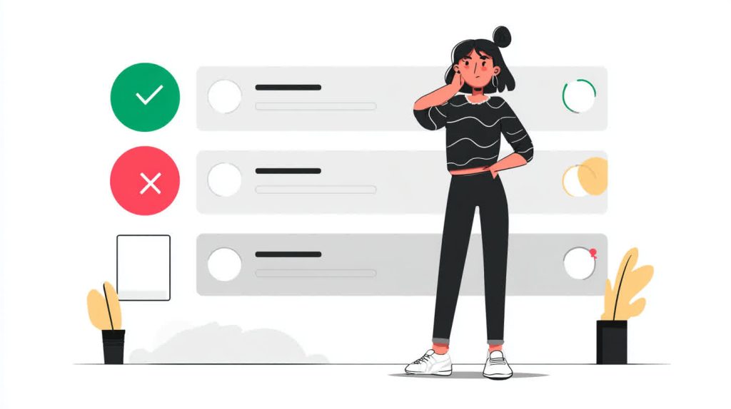
In the digital world, forms are the ultimate handshake. They are the critical moment where a visitor becomes a lead, a user becomes a customer, and an inquiry becomes a conversation. Yet, for millions of users, this handshake is a brick wall. A poorly designed, inaccessible form is more than just a frustration; it’s a dead end. For businesses, it’s a silent conversion killer, turning away qualified customers without a trace.
The numbers are stark. The global market of people with disabilities and their families represents an annual disposable income of over $13 trillion. If your website’s forms are not accessible, you are actively excluding a massive segment of this market. This isn’t just about social responsibility; it’s about smart business. This is where form accessibility becomes a cornerstone of modern web development—not as an afterthought, but as a primary driver of success.
By mastering the fundamentals of accessible labels, intelligent error handling, and the strategic use of ARIA, you can create forms that not only meet legal standards like ADA compliance web guidelines but also provide a superior experience for every single user. An accessible form is an intuitive, forgiving, and efficient form. It’s a form that converts. This guide will provide web designers and developers with the practical knowledge and code examples needed to build forms that welcome everyone and boost your bottom line.
Why Form Accessibility Matters More Than You Think
Many development teams view accessibility as a niche compliance issue, a box to be checked at the end of a project. This perspective is fundamentally flawed. Form accessibility is intrinsically linked to usability, legal compliance, and brand perception. It’s a trifecta of benefits that no business can afford to ignore.
The Business Case: Conversions, Reach, and Reputation
At its core, an accessible form is a more usable form for everyone. Think of a user trying to fill out a form on a mobile device in bright sunlight, or a power user tabbing through fields with a keyboard, or someone temporarily unable to use their mouse due to an injury. The principles that make a form usable for someone with a permanent disability create a better, more resilient experience for all users in various situations.
- Increased Conversions: When a form is easy to understand and navigate, abandonment rates plummet. Clear labels, helpful error messages, and logical keyboard flow remove friction from the user journey, leading directly to higher completion rates.
- Expanded Market Reach: The CDC reports that 27% of adults in the United States have some type of disability. By ignoring their needs, you are willingly shrinking your addressable market. Building accessible experiences opens your digital doors to this significant and loyal customer base.
- Enhanced Brand Reputation: In today’s market, consumers increasingly favor brands that demonstrate strong ethical values. A commitment to inclusivity and accessibility is a powerful differentiator that builds trust and fosters positive public perception.
The Legal Case: ADA Compliance and WCAG Standards
The legal landscape for digital accessibility is rapidly evolving. The Americans with Disabilities Act (ADA) has been consistently interpreted by U.S. courts to apply to websites as “places of public accommodation.” This means that an inaccessible website—and its forms—can be a source of significant legal risk, leading to demand letters, lengthy lawsuits, and costly settlements.
The key to achieving ADA compliance web standards is to follow the Web Content Accessibility Guidelines (WCAG). These guidelines are the globally recognized benchmark for web accessibility. When it comes to forms, WCAG forms criteria are specific and detailed, covering everything from labels and instructions to error identification and validation. Adhering to WCAG is your safest and most effective strategy for mitigating legal risk.
The Human Case: Removing Digital Barriers
Beyond the business and legal arguments lies the most important reason: the human impact. For a person using a screen reader, a form without proper labels is a confusing jumble of disconnected input fields. For someone with color blindness, an error indicated only by a red border is completely invisible. For a user with motor tremors, a tiny radio button that requires precise clicking is an insurmountable obstacle. Inaccessible forms don’t just create inconvenience; they create exclusion, denying individuals with disabilities equal access to services, information, and opportunities.
The Foundation: Meaningful and Associated Labels
The single most important element of form accessibility is the humble <label>. Its purpose is to provide a visible description and, crucially, a programmatic link to its corresponding form control. Getting this right is the first and most critical step.
The Golden Rule: Never Rely on Placeholders Alone
One of the most common and damaging accessibility mistakes is using placeholder text as a label. While it might seem like a clean, minimalist design choice, it creates a cascade of usability problems.
- It Disappears: Once the user starts typing, the placeholder vanishes, forcing them to rely on memory to recall the field’s purpose. This increases cognitive load and the likelihood of errors.
- Poor Contrast: Placeholder text is typically light gray, which fails to meet WCAG contrast requirements for many users with low vision.
- Screen Reader Failure: Most screen readers do not treat placeholder text as a proper label, meaning they won’t announce it to the user. An input field without a label is a mystery box.
The for and id Attributes: Your Best Friends
The most robust and recommended method for associating a label with its input is using the for and id attributes. The for attribute of the <label> must exactly match the id of the <input>.
<!-- CORRECT: Explicit labeling with for/id -->
<label for="userEmail">Email Address:</label>
<input type="email" id="userEmail" name="email">
This explicit association does two wonderful things:
- It Creates a Programmatic Link: Screen readers and other assistive technologies can now understand that the text “Email Address:” is the label for the specific input field with the
idof “userEmail”. When the user focuses on the input, the screen reader will announce the label. - It Increases the Clickable Area: Clicking on the label text will now set focus to the corresponding input field. This is a huge benefit for users with motor impairments who may have difficulty targeting a small input box.
While it is possible to implicitly associate a label by wrapping the input element within it, the for/id method is more explicit, flexible with styling, and universally supported by all assistive technologies.
Labels for Complex Inputs: fieldset and legend
For groups of related inputs, like radio buttons or checkboxes, a simple label on each one isn’t enough. Users, especially those using screen readers, need to understand the question that the group is asking. This is where <fieldset> and <legend> are essential.
The <fieldset> element groups the related controls, and the <legend> acts as the overarching label for the entire group.
<!-- CORRECT: Grouping radio buttons for context -->
<fieldset>
  <legend>Choose your shipping method:</legend>

  <div>
    <input type="radio" id="shippingStandard" name="shipping" value="standard">
    <label for="shippingStandard">Standard (5-7 business days)</label>
  </div>

  <div>
    <input type="radio" id="shippingExpress" name="shipping" value="express">
    <label for="shippingExpress">Express (1-2 business days)</label>
  </div>
</fieldset>
Without the <fieldset> and <legend>, a screen reader user would just hear “Standard” and “Express” without knowing they are options for the shipping method. This grouping provides the critical context that makes the form usable.
Handling Errors with Grace and Clarity
Errors are inevitable. A user will mistype an email, forget a required field, or enter an invalid format. An accessible form anticipates this and communicates errors in a way that is helpful, not hostile.
The Problem with Vague, Inaccessible Errors
Bad error handling is rampant across the web. You’ve seen it before: after clicking “Submit,” the page reloads with a generic message like “Please fix the errors below,” and one or more fields are simply outlined in red.
This approach fails on multiple levels:
- Color-Only Indicators: Relying solely on color excludes users with color blindness.
- Lack of Description: The user doesn’t know why the field is incorrect. Is it empty? Is the format wrong?
- No Programmatic Association: A screen reader has no idea an error has occurred. It won’t announce the red border or the vague message at the top of the page.
The Three Pillars of Accessible Error Handling
To comply with WCAG forms guidelines and create a good user experience, error messages must follow three principles:
- Identify: Programmatically and visually mark the field that contains an error. This should include more than just color (e.g., an icon, bolding the label, a thicker border).
- Describe: Provide a clear, human-readable message explaining what the error is and, if possible, how to fix it. “Required field” is okay, but “Please enter your first name” is better.
- Locate: Make it easy for all users to find and fix the errors. For screen reader users, this means programmatically linking the error message to the input field.
The ARIA Connection: aria-invalid, aria-describedby, and aria-live
Accessible Rich Internet Applications (ARIA) attributes are essential for communicating form errors to assistive technologies.
aria-invalid="true": This attribute is added to the input field when an error is detected. It programmatically tells a screen reader that the field’s current value is invalid.aria-describedby: This is the magic that connects the input to its specific error message. You give your error message<span>or<div>anid, and then reference thatidin thearia-describedbyattribute on the input. This tells the screen reader, “When this input is focused, also read the content of the element with this other id.”aria-live: For client-side validation that happens without a page reload, you need a way to announce a summary of errors. An element witharia-live="polite"will do just that. When error messages are added to this region, a screen reader will announce them once it has finished its current task, preventing interruption.
Here is a code example putting it all together for an email field:
<label for="userEmail">Email Address:</label>
<!-- aria-describedby points to BOTH the hint and the error message -->
<input
  type="email"
  id="userEmail"
  name="email"
  aria-describedby="emailHint emailError"
  aria-invalid="true">

<!-- Hint text for formatting -->
<span id="emailHint" class="hint">e.g., [email protected]</span>

<!-- The error message, initially hidden -->
<span id="emailError" class="error-message">
  Please enter a valid email address.
</span>
In this example, when the user focuses on the invalid email field, a screen reader would announce something like: “Email Address, edit, invalid entry, e.g., [email protected], Please enter a valid email address.” The user gets all the context they need to understand and fix the problem.
Leveling Up with ARIA: When HTML Isn’t Enough
The first rule of ARIA is: if you can use a native HTML element that provides the accessibility you need, do that instead. HTML’s built-in elements like <button>, <input>, and <select> have accessibility baked in. However, when building custom components or dealing with complex, dynamic interfaces, ARIA becomes an indispensable tool for bridging the accessibility gaps.
Required Fields and Instructions
Clearly marking required fields is fundamental to good form usability.
- HTML’s
requiredAttribute: The simplest and best way to mark a field as mandatory is with the booleanrequiredattribute. This has built-in browser support and is understood by assistive technologies. You should also provide a visible indicator, such as an asterisk (*), and explain its meaning at the start of the form.<label for="firstName">First Name *</label> <input type="text" id="firstName" name="first_name" required> aria-required="true": You should only usearia-required="true"when the nativerequiredattribute is not supported on the element you are using, such as a custom-built form control that uses a<div>with aroleattribute.- Providing Instructions: What if a field has specific formatting requirements, like a password? Don’t hide this information in a placeholder. Instead, place it in a visible element and associate it with the input using
aria-describedby, just as we did for error messages.<label for="password">Password</label> <input type="password" id="password" name="password" aria-describedby="passwordHint" required> <span id="passwordHint" class="hint"> Must be at least 8 characters long. </span>
Putting It All Together: A Checklist for Accessible Forms
Auditing your forms can feel daunting. Use this checklist as a guide to ensure you’re covering the most critical aspects of form accessibility and meeting the core requirements of WCAG forms guidelines.
- [ ] Labels for All: Every single form control has a visible
<label>element that is programmatically associated using theforandidattributes. - [ ] No Placeholder Labels: Placeholder text is used only for supplementary hints, never as the primary label.
- [ ] Logical Grouping: Related controls (like radio buttons or a series of address fields) are grouped using
<fieldset>with a descriptive<legend>. - [ ] Clear Instructions: Any required formatting or special instructions are provided in visible text and associated with
aria-describedby. - [ ] Visible Focus: It is always visually apparent which form element currently has focus when navigating with a keyboard. The default browser outline has not been removed without a clear replacement.
- [ ] Accessible Error Messages: Errors are communicated using text, icons, and programmatic links (
aria-invalid,aria-describedby), not just color. - [ ] Keyboard Navigable: The entire form can be completed from start to finish using only the keyboard, in a logical order.
- [ ] Real-World Testing: The form has been tested using a screen reader (like NVDA on Windows or VoiceOver on Mac) to ensure the experience makes sense.
Conclusion
Form accessibility is not a niche requirement or a final-stage compliance check. It is a fundamental practice of good design and development that delivers tangible returns. By building forms with clear labels, helpful errors, and correct semantic structure, you create a more intuitive and efficient experience for every user.
This commitment to inclusivity is a direct path to achieving ADA compliance web standards, protecting your organization from legal risk. More importantly, it breaks down digital barriers and expands your audience. The result is a website that is not only more compliant and ethical but also more effective. An accessible form is a high-converting form. Start auditing your forms today and build a web that is more inclusive, more usable, and more profitable.